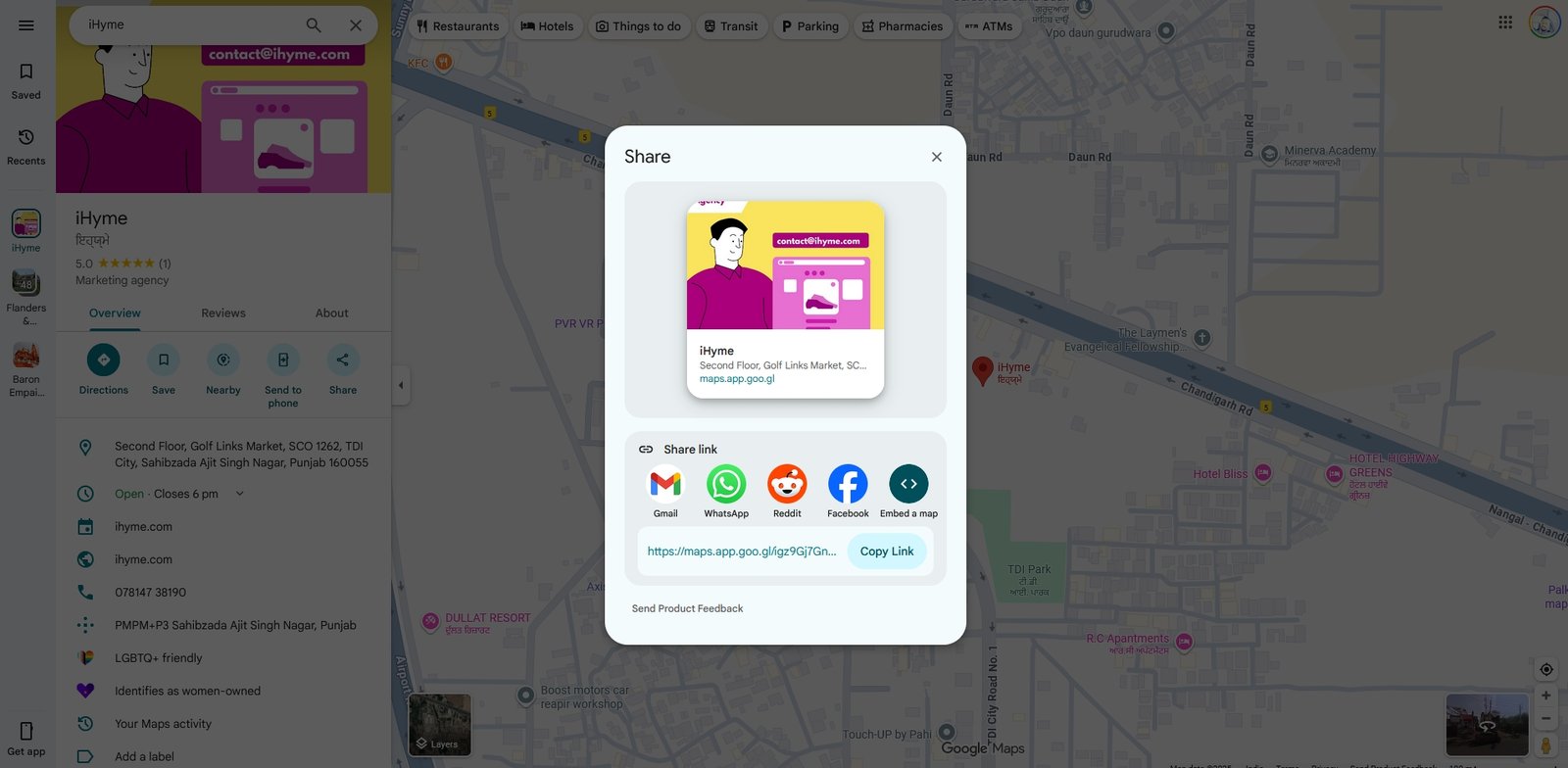
Google has recently updated the design of its Share Map feature in Google Maps as part of broader enhancements to the app’s interface and functionality. The new Share Map design introduces a cleaner, more intuitive layout that makes it easier for users to share map locations and directions seamlessly.
Instead of the previously more cluttered and fullscreen menus, this redesign uses a sheet-based layout with rounded edges, allowing users to see more of the map behind the sharing options. This approach avoids overwhelming the screen and keeps the map context visible, improving usability especially on smaller devices.

In addition to the visual changes, the updated share interface now includes clearer close and share buttons, reducing accidental dismissals of the share panel. This makes sharing location cards quicker and more straightforward. The redesigned share card no longer takes up the entire screen when opened, enhancing the overall navigation experience with a less intrusive and cleaner look.
This Share Map redesign is part of ongoing efforts by Google to make Maps easier to use and more accessible for all users. Other concurrent updates include better placement of transportation options, a streamlined search bar that focuses solely on address input, and improvements aimed at one-handed mobile use. Google has been gradually rolling out these design changes to Android users, with the goal to eventually update all users across devices.
The changes reflect a trend towards minimalism and practical accessibility, complementing recent Google Maps upgrades like modernized pins and AI-powered features that improve navigation and map interactions. Overall, the Share Map design change enhances sharing on Google Maps by making it less intrusive, more user-friendly, and visually cleaner while retaining important map context.


